Website Design
2024
SPO
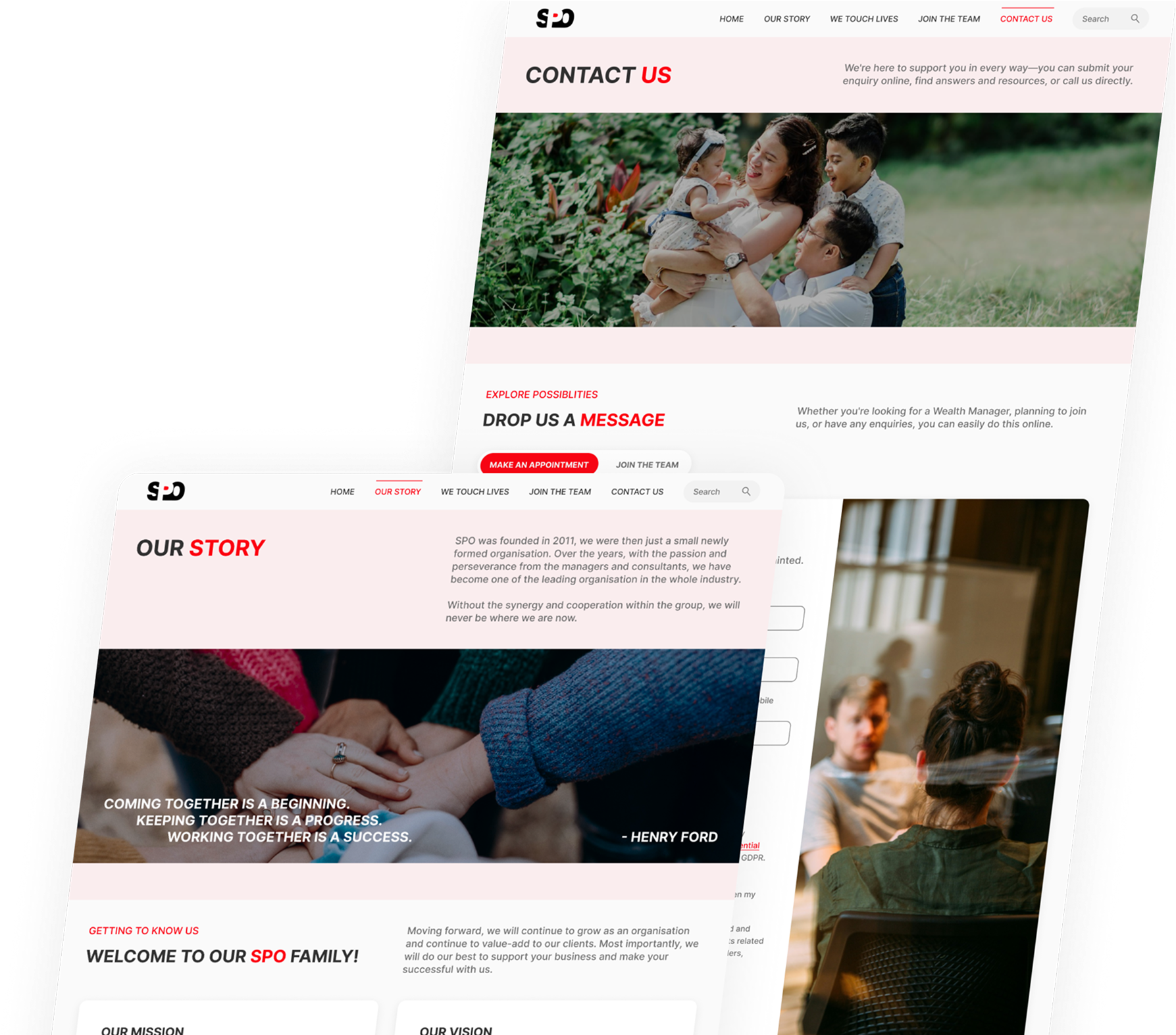
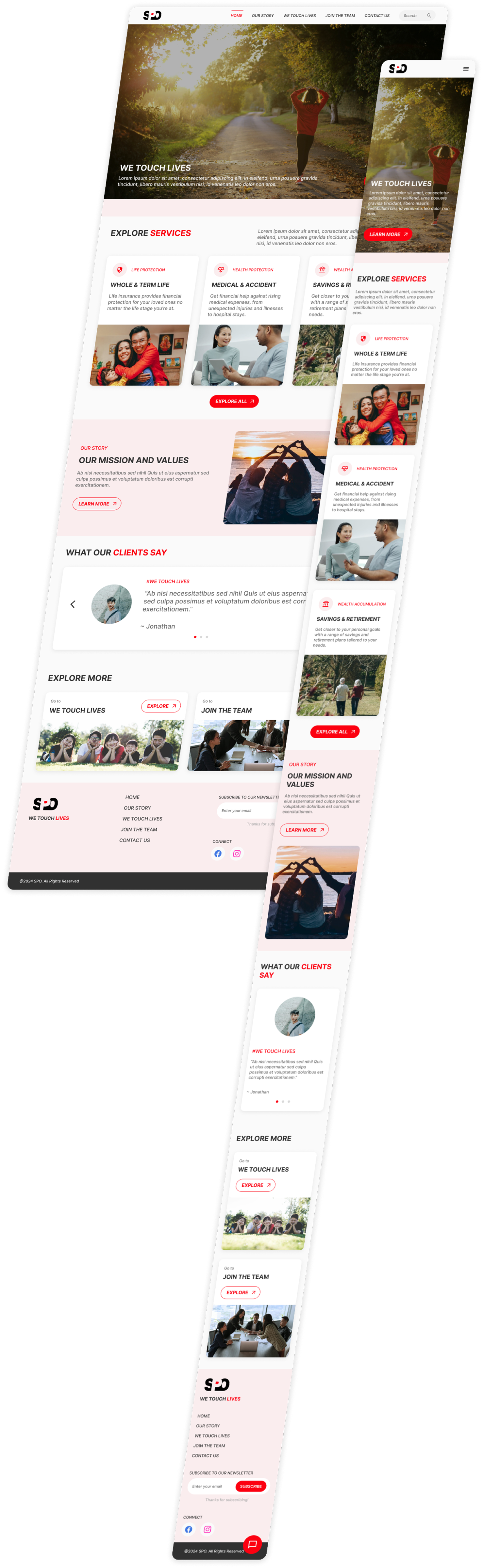
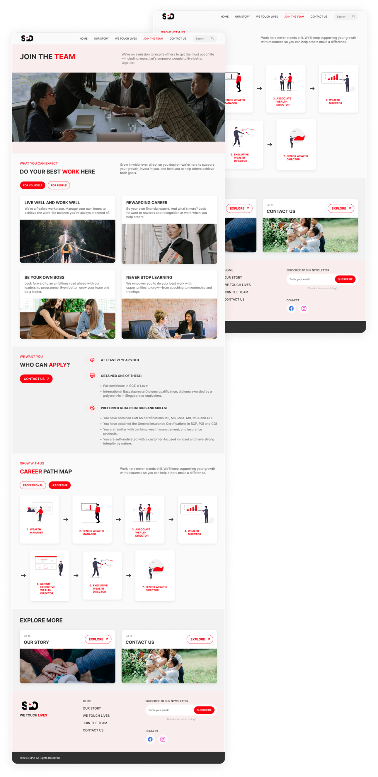
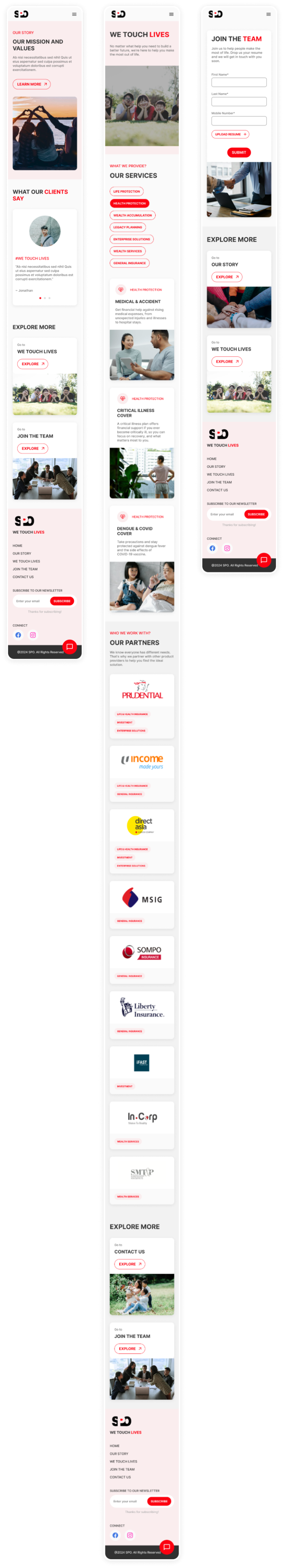
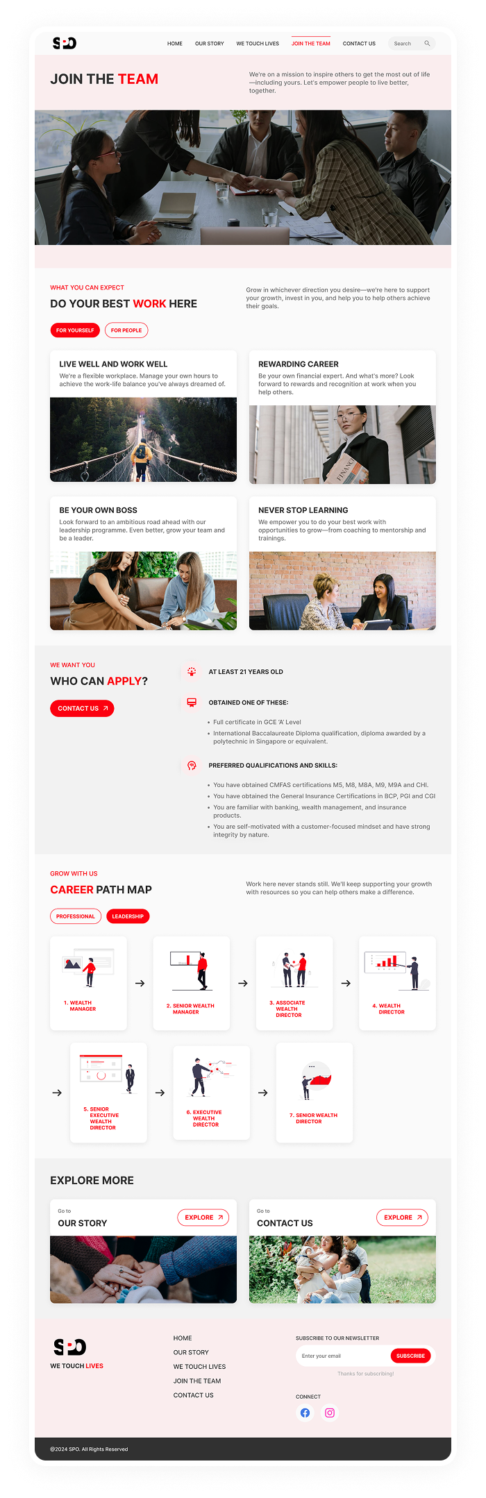
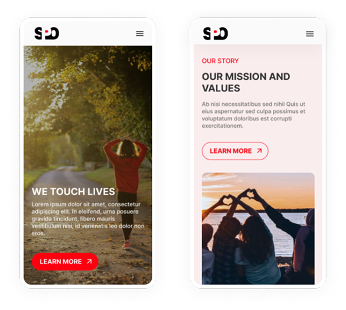
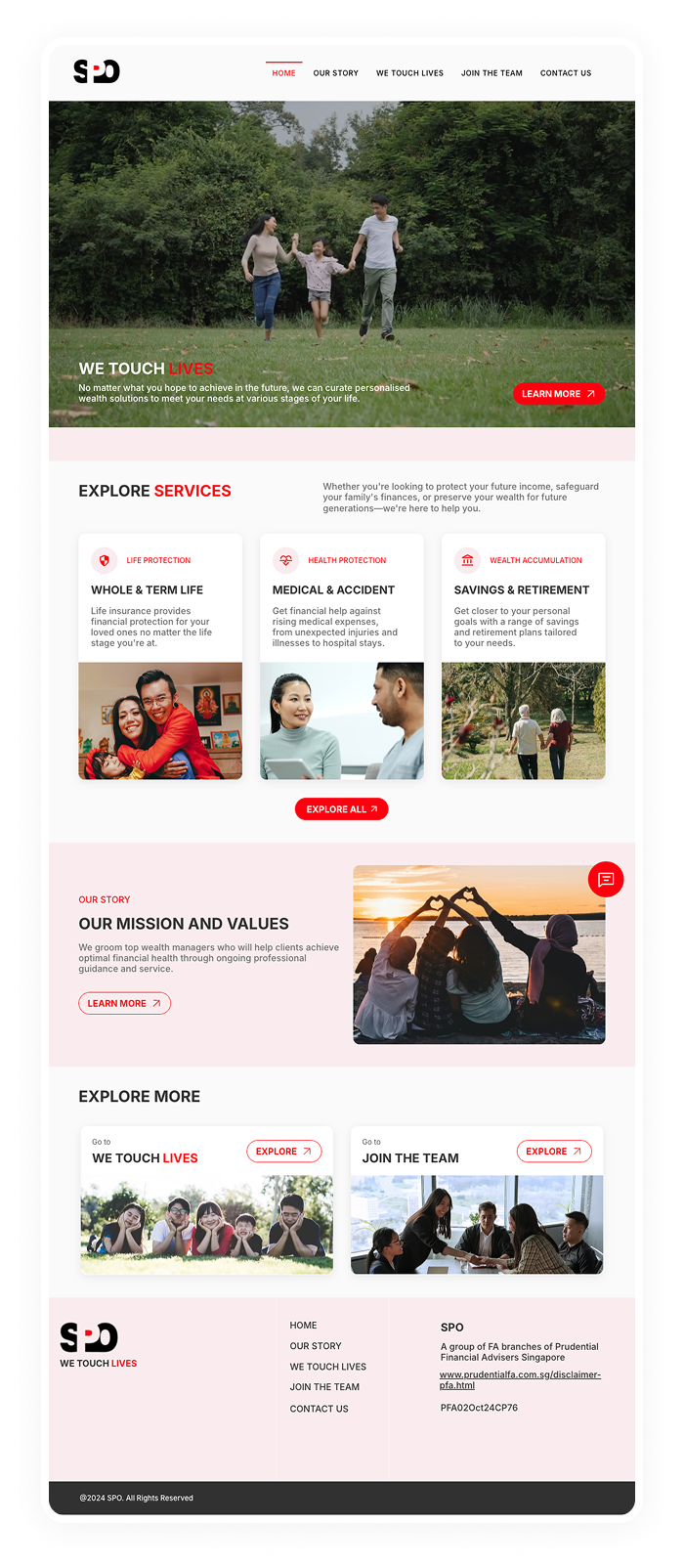
In this project, we aim to build a website for an insurance client that showcases their services, features their team, and communicates their mission and values, all to enhance visibility and attract a larger customer base.
Hi-Fi Prototype
Link arrow_outwardWebsite URL
Link arrow_outward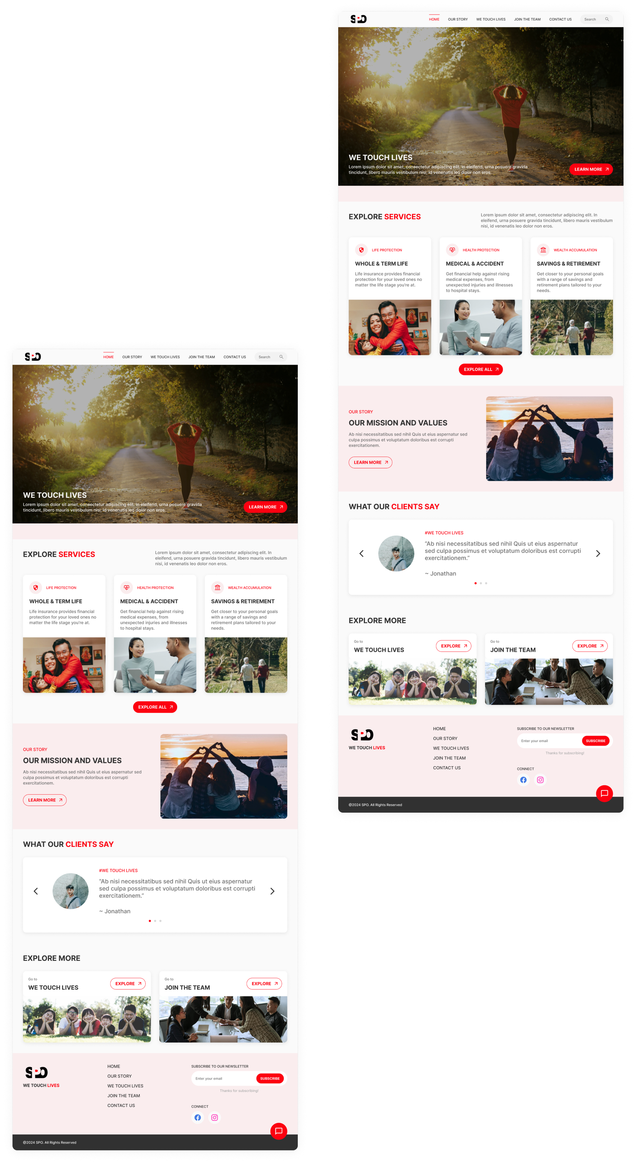
Branding
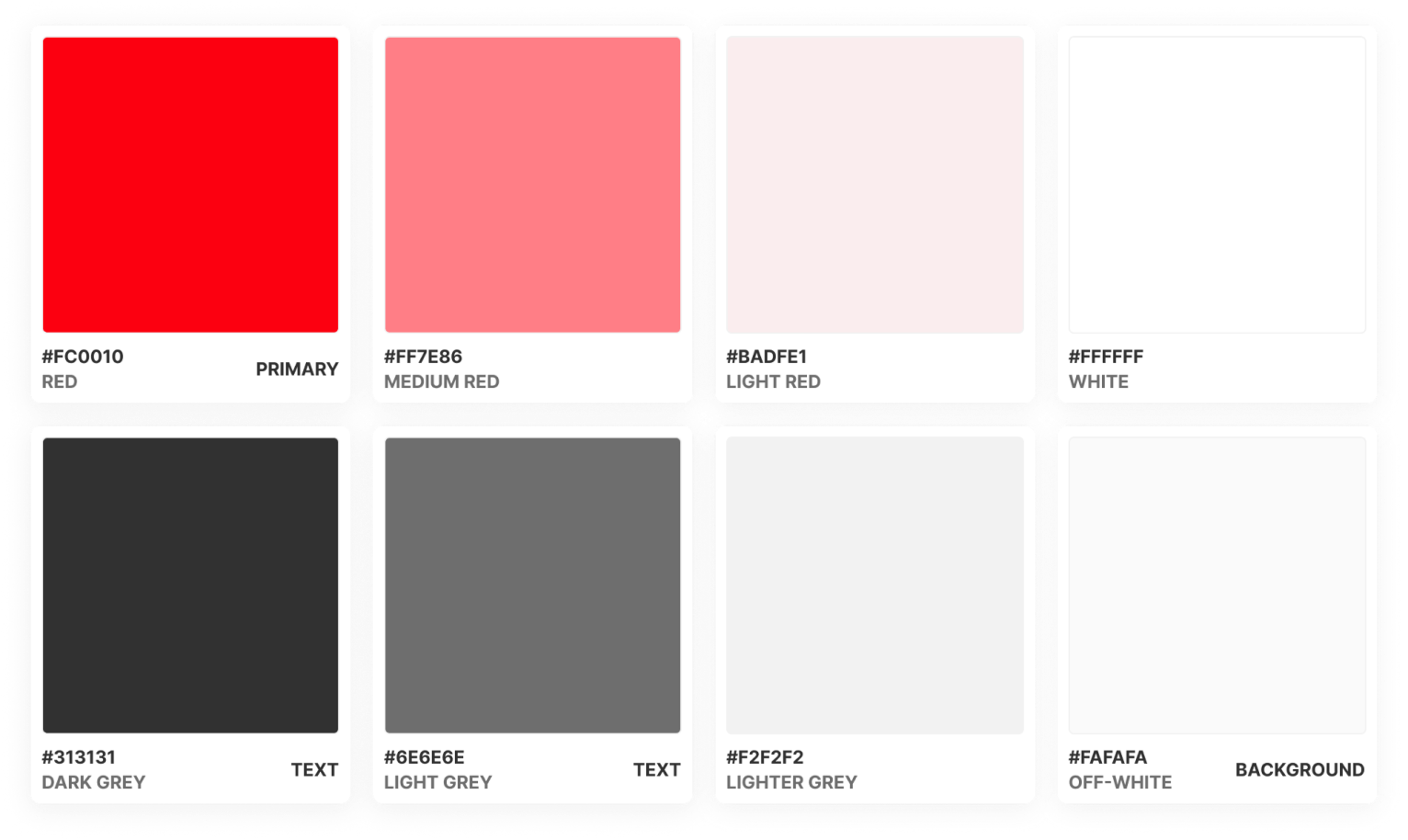
Colour Scheme
Building on the client's brand identity, accent colors that enhance warmth and approachability while maintaining a professional aesthetic are incorporated.
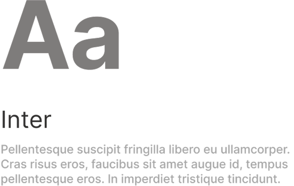
Typography
The Inter typeface elevates the design with its clean geometry, balancing professional clarity with approachable readability.
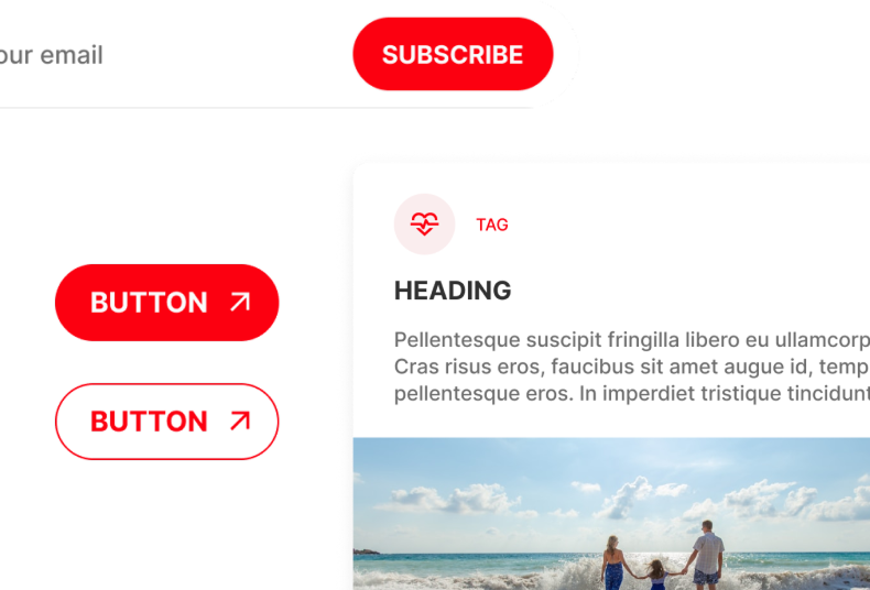
Components
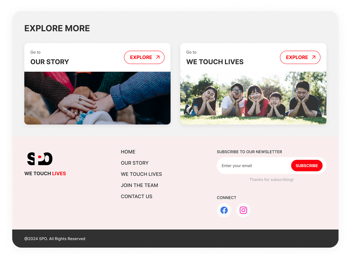
Rounded elements are incorporated throughout the interface to create a more welcoming user experience and achieve a modern, friendly aesthetic.