Case Study
2024
L'Histoire
L'Histoire is an eBook app that allows readers to be able explore and read through a wide collection of different books and novels. This app aims to provide a one stop solution for readers to be able to store their existing library as well in the app as well as adding new books to read into their collections through the app.
Lo-Fi Prototype
Mobile arrow_outwardHi-Fi Prototype
Mobile arrow_outward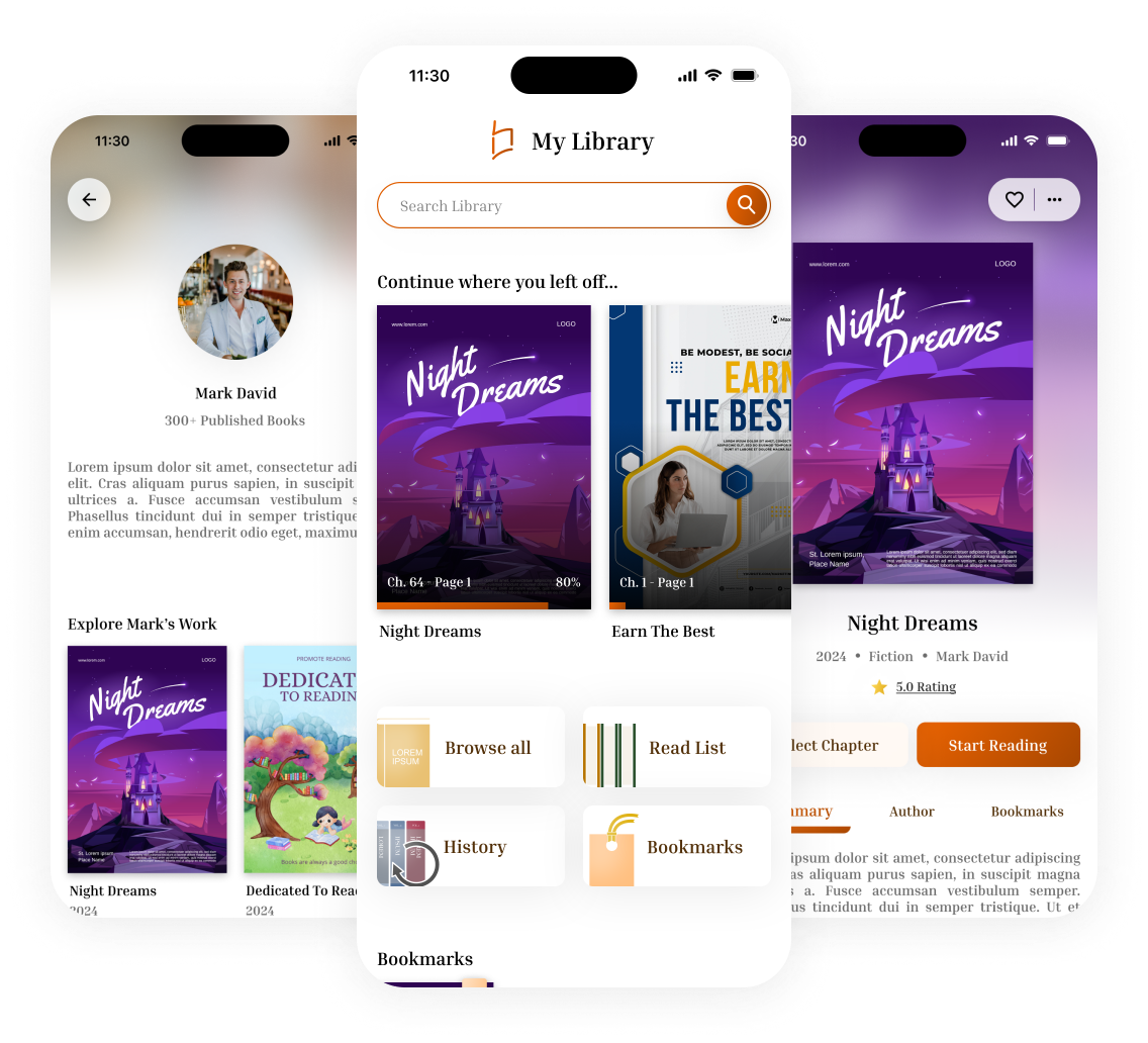
Proto Personas
Guided by user research, we developed two proto-personas that capture our target audience’s goals, behaviors, and pain points
.png)
.png)
Branding
Aa
Typography
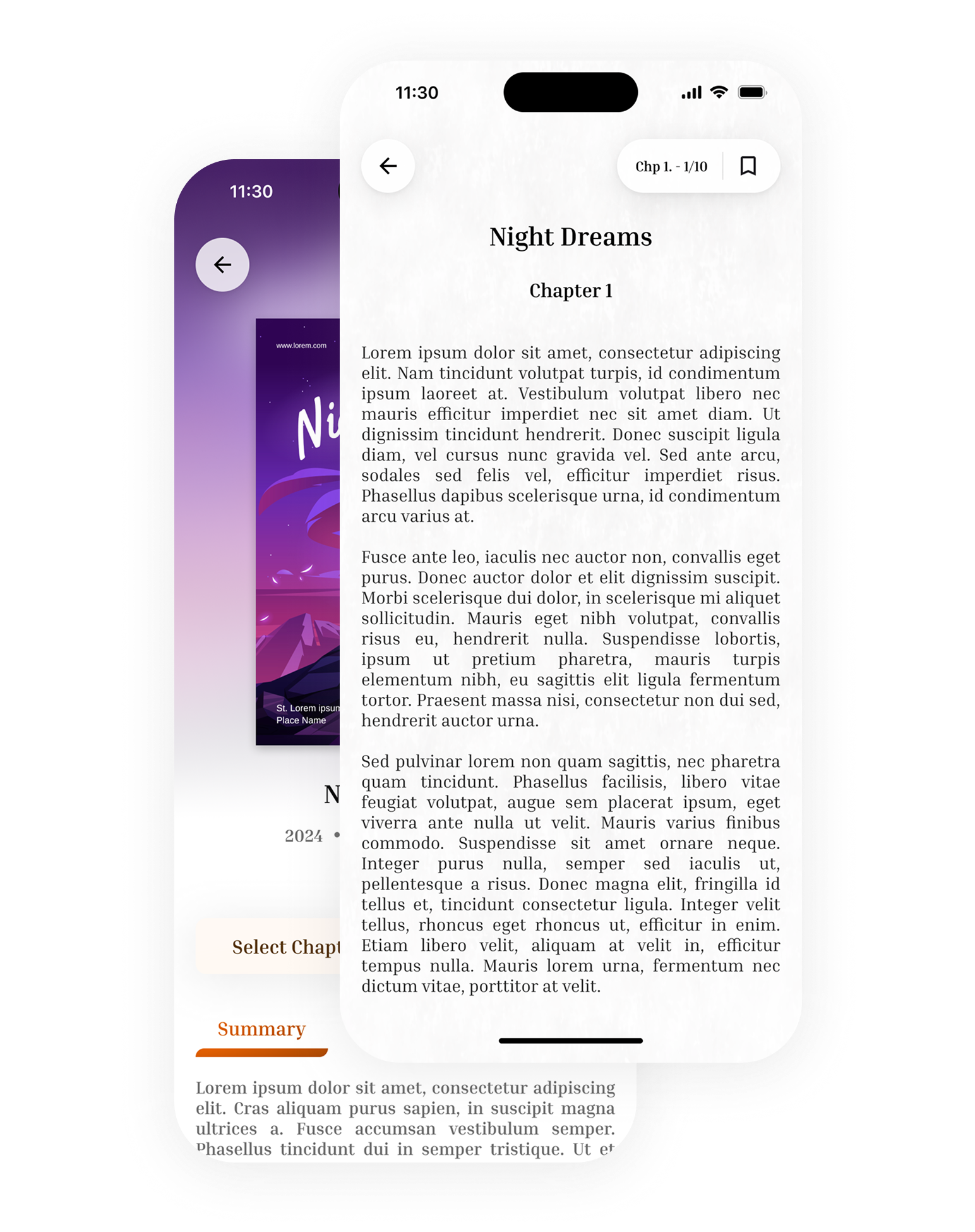
The Inria Serif font recreates the experience of physical books, making digital reading feel familiar and engaging.
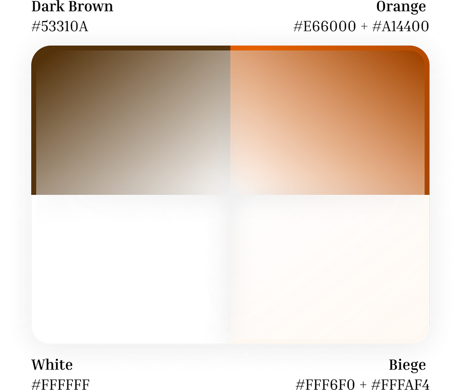
Colour Scheme
The color scheme intentionally employs warmer, brown-leaning tones to cultivate an approachable and inviting aesthetic.
Design Philosophy
The design prioritizes authenticity, incorporating paper-like textures for pages and subtle gradients to create an inviting, tactile experience.
Design Considerations
.png)
My Library - Resume Reading
Users can easily access their in-progress readings here, with the ability to continue from their last reading session.
.png)
My Library - Quick Access
Designed for efficiency, this area unifies library access, reading lists, history, and bookmarks. Strategic graphical elements support both functionality and inclusive design.
.png)
My Account - Track Progress Effortlessly
A goal progress tracker has been integrated into the account page, enabling users to check their status at a glance.
Refinements

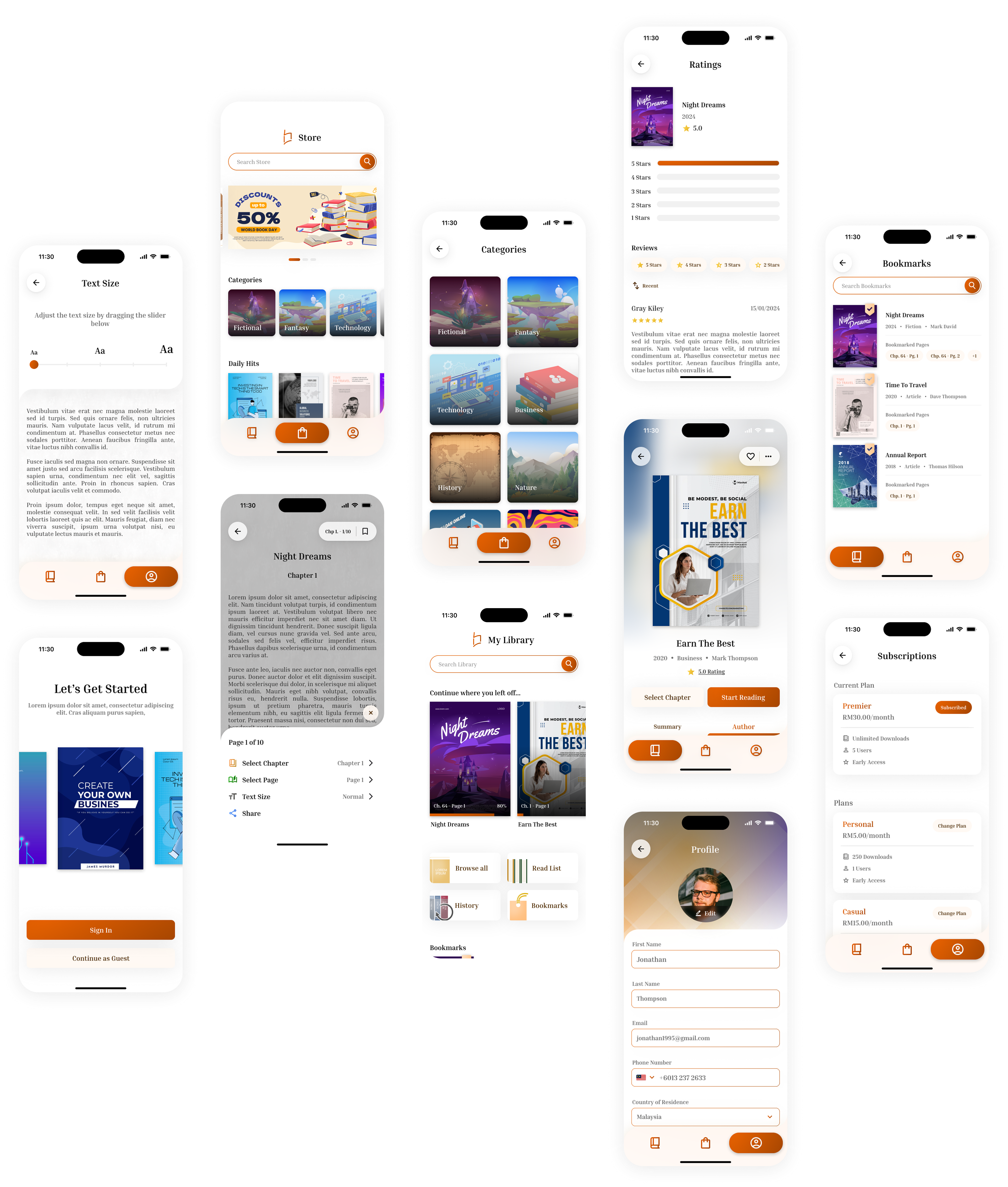
Refinements #1
The main updates involve changing the search button to a search
bar, enhancing user cognition by clearly indicating that they can browse their library through this
feature.
Additionally, the book tiles now displays the chapter where the user last left off, rather than just
indicating the progress. The progress bar has also been moved to the bottom of the tile
to create a reduce distraction when revisiting books.
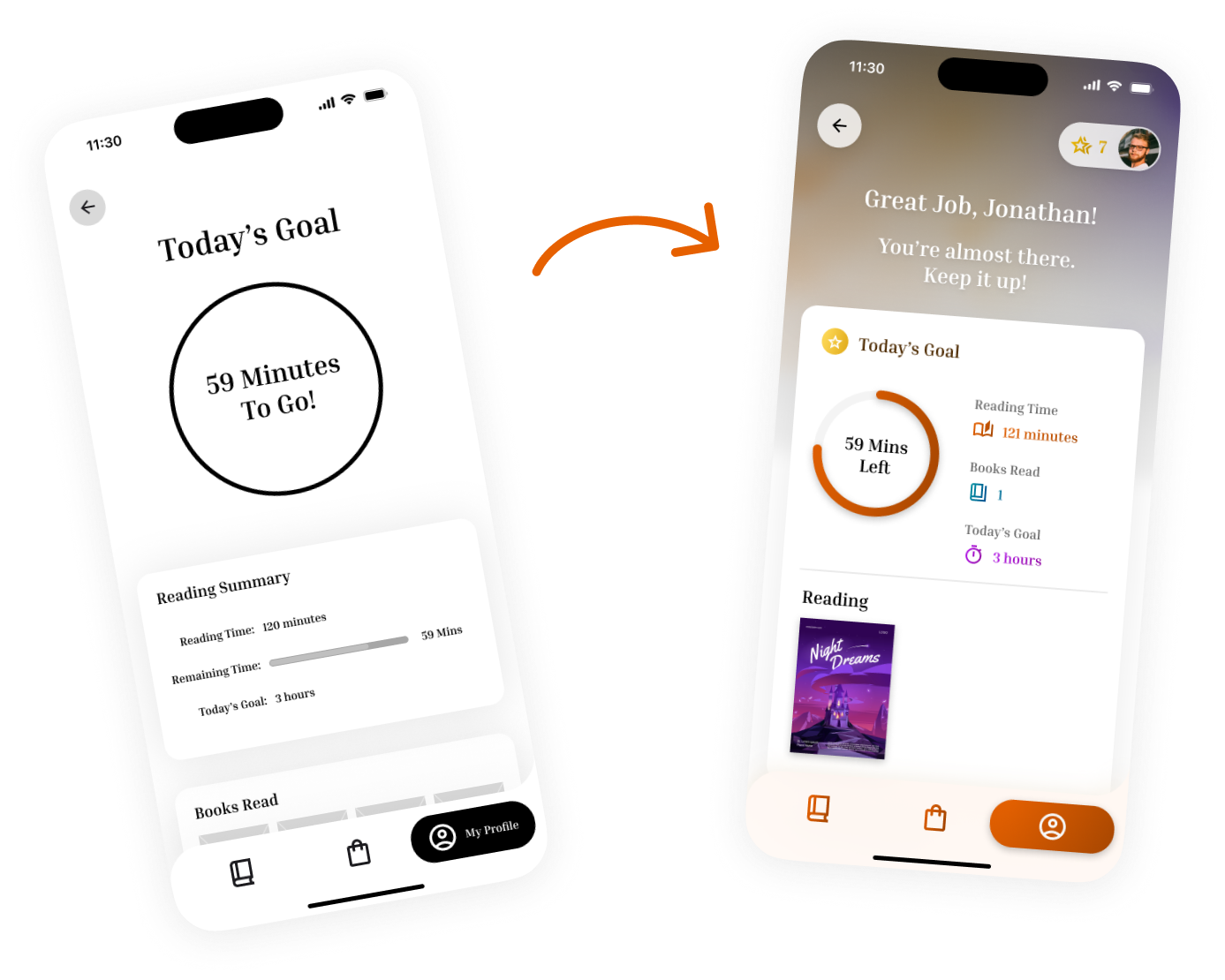
Refinements #2
Introducing a card-style layout to display
goals along with a new gradient backdrop with a greeting message to create a more welcoming user experience.
Another update includes the user’s achievements tab at the top right of the page. This tab allows users to view their current achievements and check the requirements for
earning new ones.
Accessibility Considerations
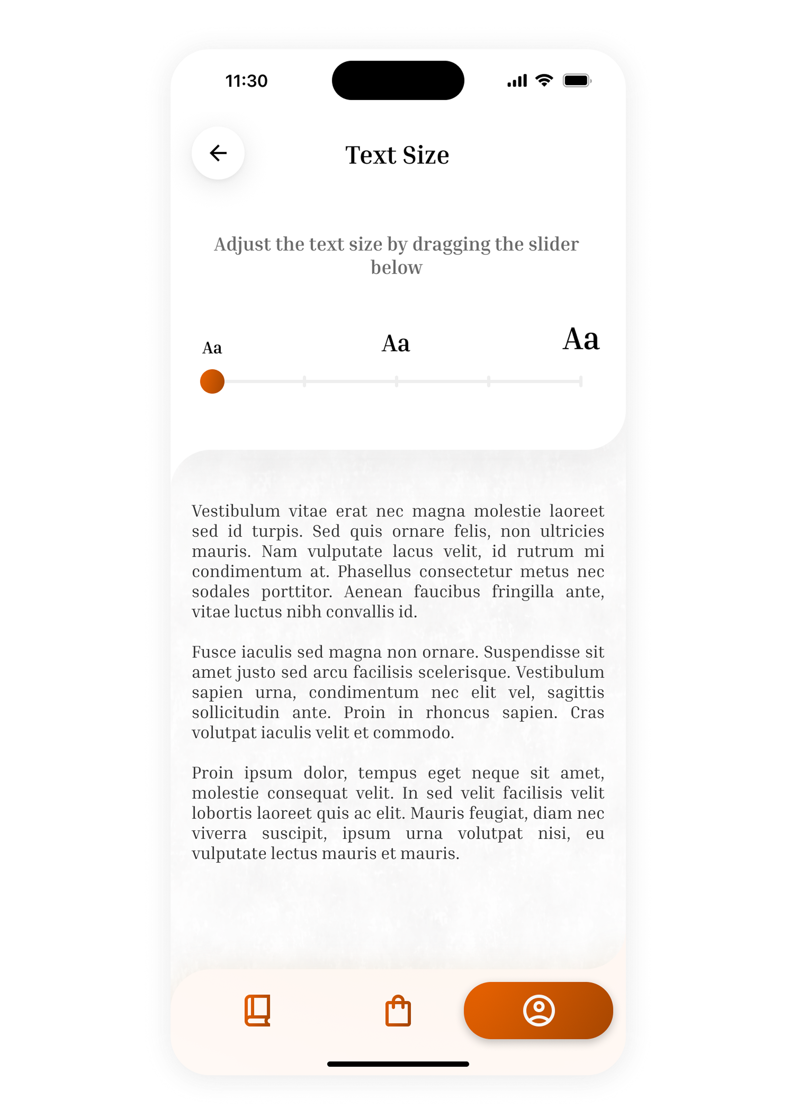
Reader-First Design
The interface design focuses on optimizing the core reading experience. Key accessibility features like adjustable text size empower users to personalize their viewing comfort. Additionally, I implemented a clear heading hierarchy using bold, larger fonts for primary headings and progressively smaller text for sub-sections improve scannability and logical flow.
Going Forward
This project taught me that effective UI design requires careful consideration of multiple factors, including feature quantity and user flows. Hence, proper planning is essential before beginning design work—mapping out all potential user flows, determining their implementation, and evaluating how they impact the overall user experience.
Some of the vector arts and images used in this project are sourced from freepik & other contributors. View Credits